Ready to Play
HAL Casino Release Note
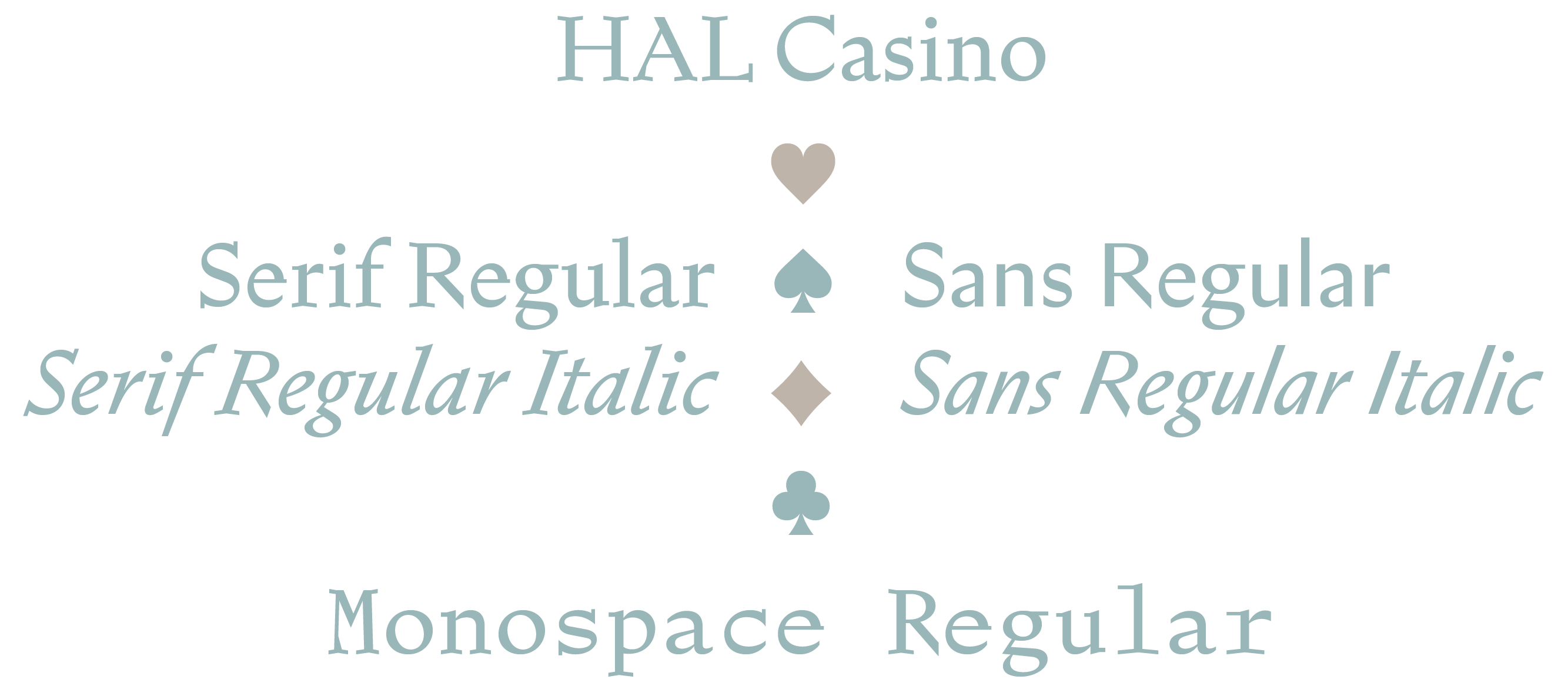
HAL Casino is an elegant, well-oiled machine on the outside, with plenty of special features under the hood; a single-weight family of five styles, including three distinct subfamilies: Serif, Sans and Mono. At first glance, the fonts appear sensibly coherent in their appearance and proportion—classic in a way. But the more you glance and review, the more unforeseen, hidden details emerge (like spotting new easter eggs when rewatching your favourite film). With its enigmatic flair, the typeface is not as straightforward as it may seem, bending and extending several genres and aesthetic vibes. Maybe this conundrum supplies some of the allure and appeal. Let’s dive in and wander down some sidetracks along the way.
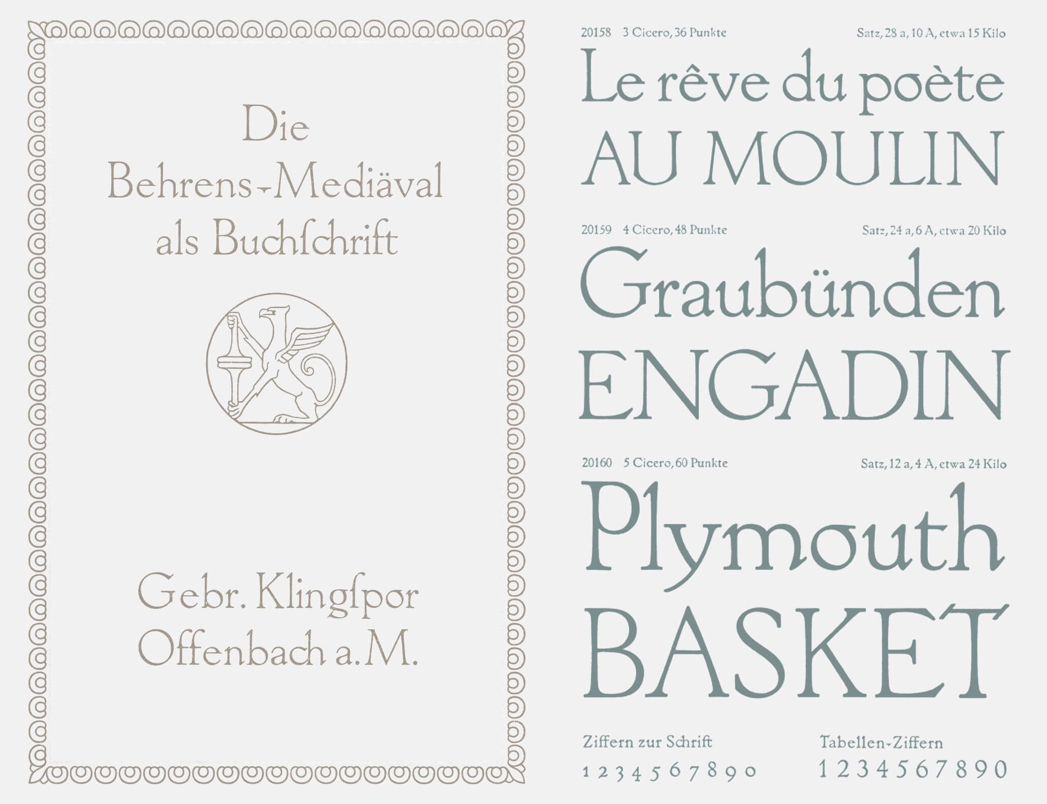
We commence the retrospective with Behrens-Mediäval, a serif typeface designed by Peter Behrens and released in 1914 by Gebrüder Klingspor in Offenbach am Main. We consider this design an early inspiration for Casino: a point of departure, from which it has clearly distanced itself. Nonetheless, we want to acknowledge Behrens’ original type designs. He created several authentic typefaces next to a vast and impressive oeuvre spanning architecture, painting, product design and more—a proper “multidisciplinary” practice, long before the term existed. Other artistic/industrial polymaths of the pre-war era are influential names such as Henry van de Velde and Josef Hoffmann. The numerous and often naive type designs by a range of versatile and idealistic artists, creators and inventors of the late 18th and early 19th century (William Morris, Otto Eckmann, Theo van Doesburg, etc.) are truly inspiring indeed.
Casino’s initial form of existence was limited to Serif Regular and Serif Regular Italic. The original intention was to draw and create a well-balanced text typeface, easy to read and effective in smaller sizes. It went through many stages of proofing and optimisation, adjusting and improving rhythm, texture and overall “greyness”. Not only the macro details, also the micro structures were frequently revisited and revised. The design of the serifs is where it gets especially interesting.
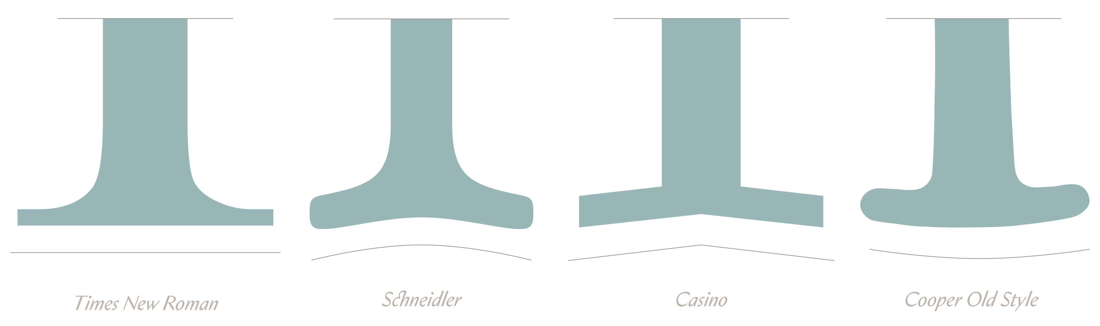
At first, the serifs were thin slabs with a slight, inward pinch at the intersecting stem, to reduce weight at the junction (like tiny ink traps). Traditionally, this can also be achieved with “cupped” serifs, where the horizontal edge of the serif is slightly curved. Hardly visible at smaller sizes, this little bend conveys a more natural, organic feeling than a perfectly straight line. And the letters appear to stand less rigid and lass static on the baseline. Countless serif typefaces include this detail in their DNA, notably obvious in F. H. Ernst Schneidler’s Schneidler-Mediäval (first published by Bauer in 1938).
Coincidentally, Schneidler began his higher education under Peter Behrens, studying architecture at the Kunstgewerbeschule Düsseldorf around the turn of the last century. Around this time, Behrens was also running a renowned architectural firm (and incubator), assisted by several young “uncut gems” such as Walter Gropius, Ludwig Mies van der Rohe and Le Corbusier (who would eventually define European modernism in decades to come). Perhaps Schneidler’s serifs were also inspired by architecture, more specifically the Corinthian column, the most ornate of the three classical orders of the ancient Greeks and Romans.
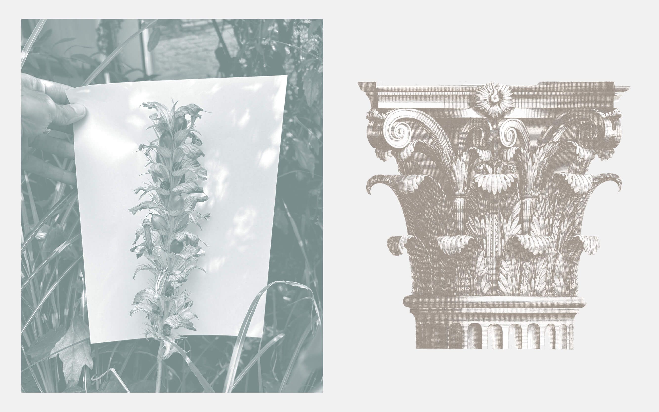
The Corinthian capitals, based on the curled leaves of the flowering acanthus plant, boast decoratively detailed, pointy and angled elements. The Tuscan forked serifs appear to be visually related (as do the split calligraphic blackletter serifs), almost triangular in shape and excessively ornamental. Do you also enjoy fantasising about formal analogies between type design and architectural history? I thought so. Let’s get together and write a book or at least start a reddit thread.
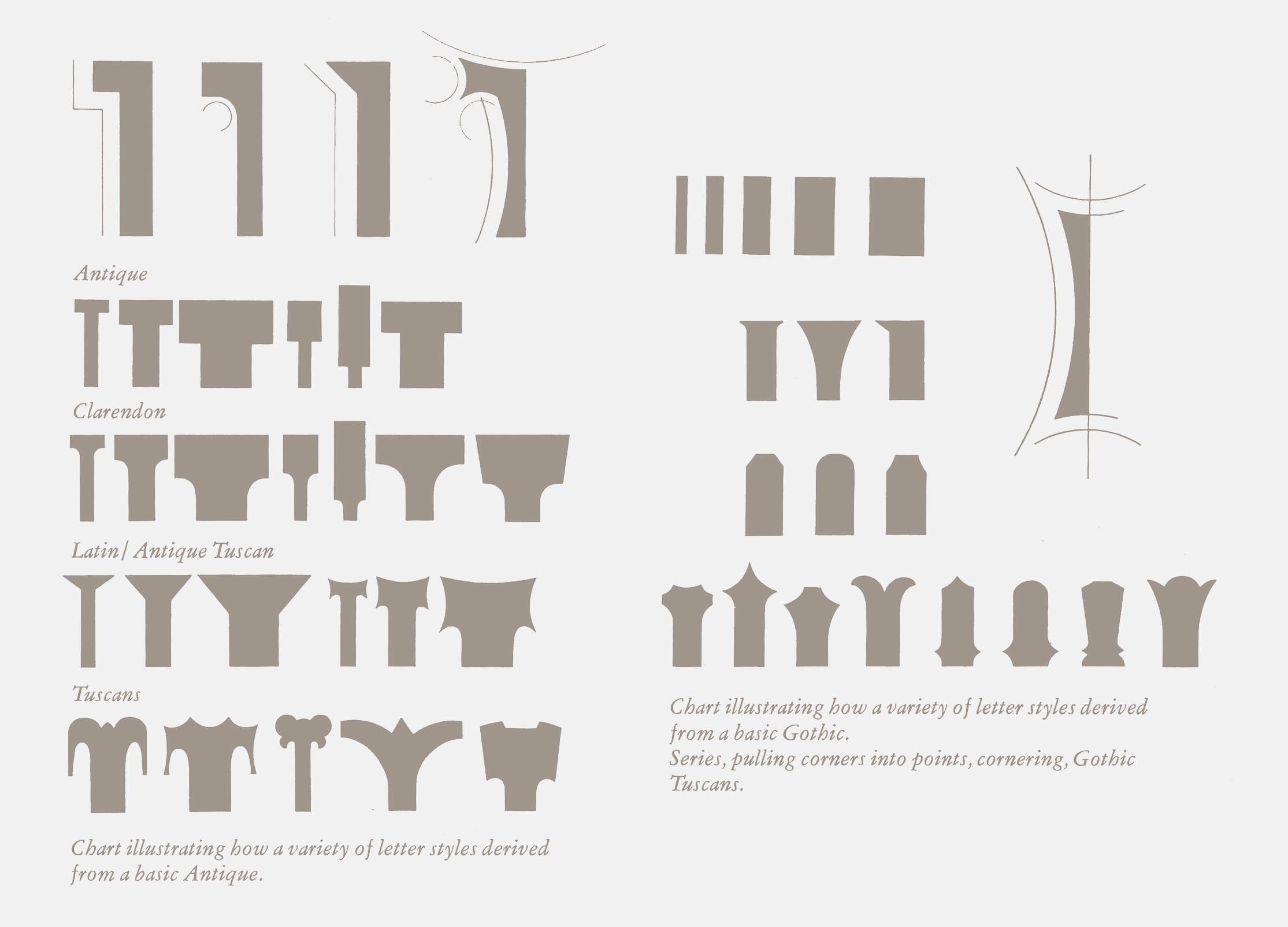
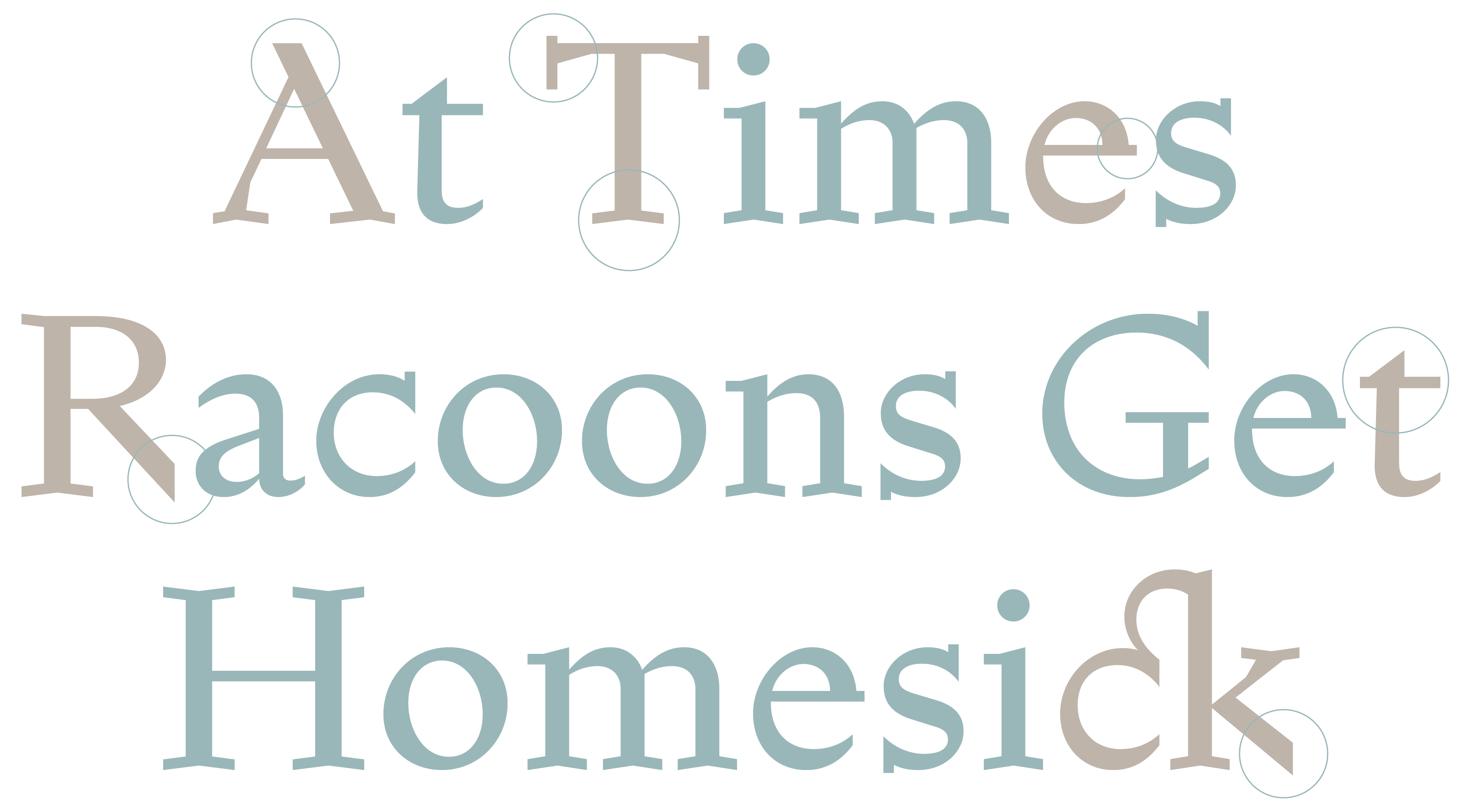
Schneidler’s work is quite inspirational and Schneidler-Mediäval a uniquely beautiful design. The legs of its serifs are strongly angled, an antithesis to Oswald Bruce Cooper’s Cooper Old Style from 1919. Casino’s serifs are an adaptation of this angular shape, but more extreme and graphically reduced and abstracted to a fractured or fragmented straight slab. This simple detail gives the characters stability at small sizes when materialised on paper or screen. Simultaneously, the serifs provide an originally distinctive and visually appealing feature when reproduced in larger displays. The structure of the serifs contributed greatly to Casino’s overall spirit and informed further small details and design decisions. It was during this stage of testing different serif styles, that we occasionally peaked at a naked Casino void of any serifs at all. It was a good look and quite naturally a sans emerged from the pursuit of the Casino’s ideal serif.
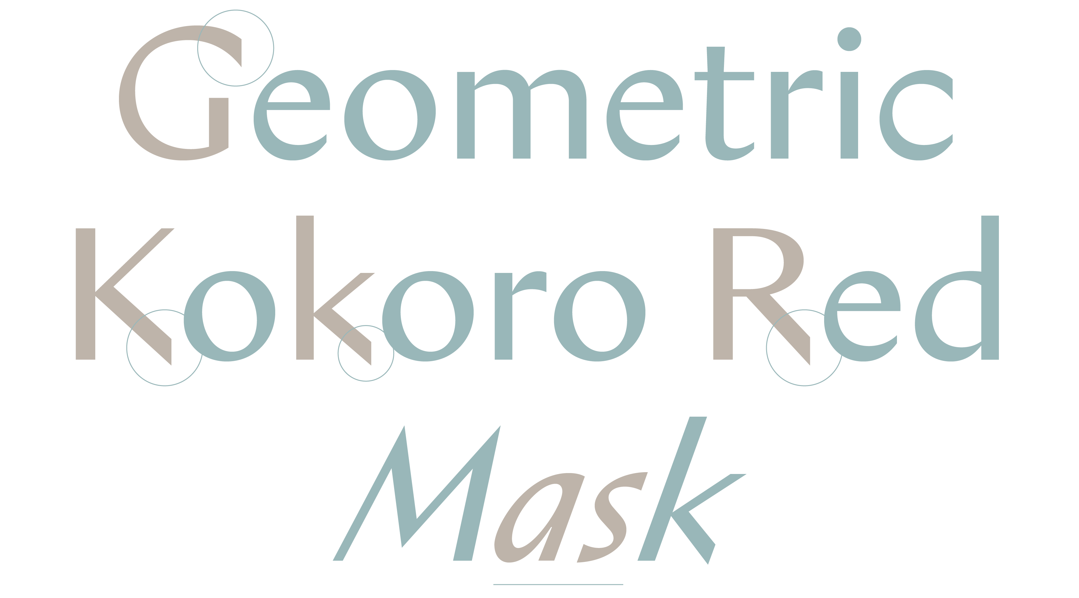

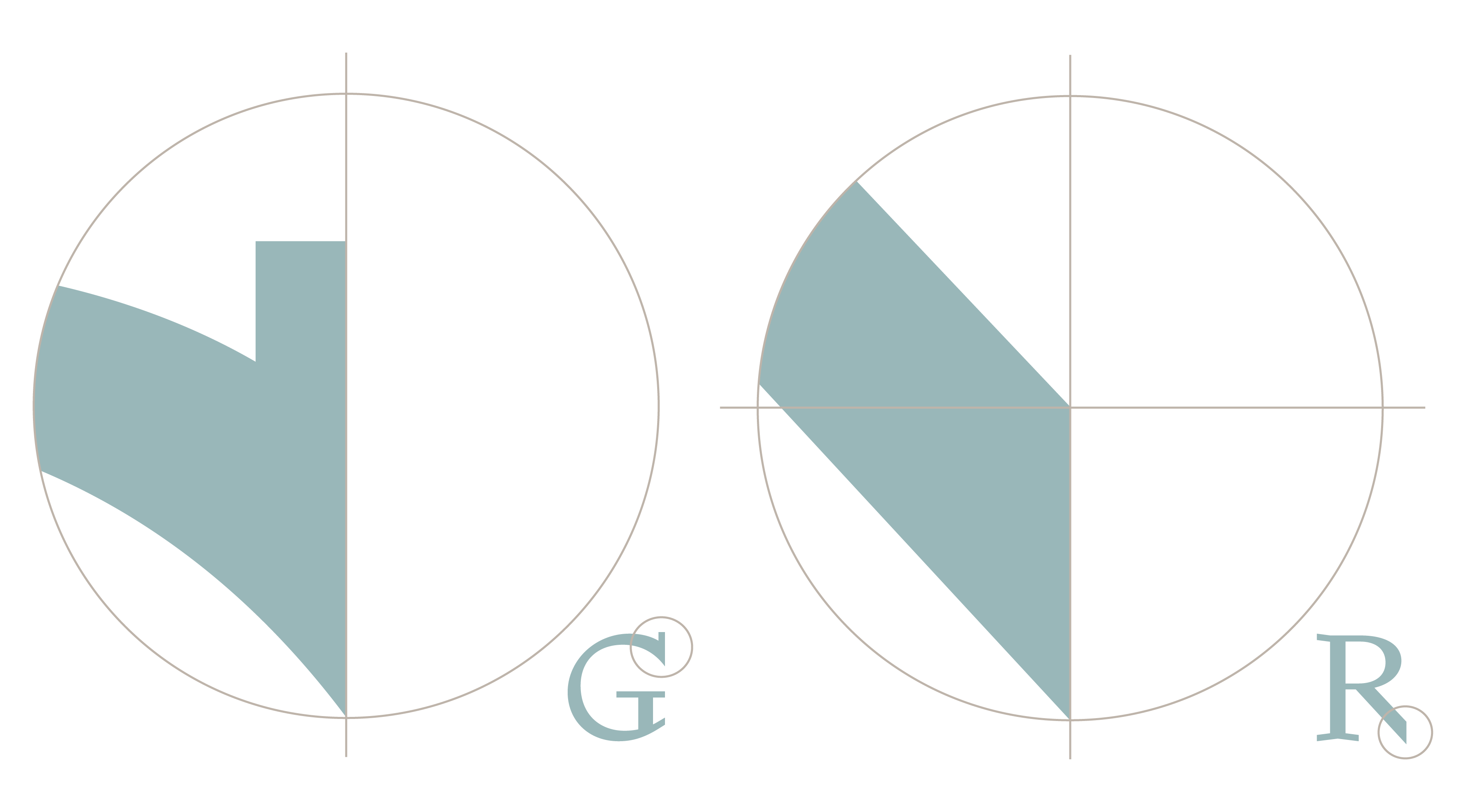
Casino Sans embodies a similar vibe as the Serif and its satisfying shift in contrast, resembling a straightened, spurless version of Optima. Our humanist sans struts some fetching, contemporary details, such as the overhang on the G or the sharp cut on the leg’s end of the K, R and k. And unlike the merely slanted Optima Oblique, Casino Sans Italic is a true italic (and stunningly gorgeous). It carries a beautiful dynamism and stride in its satisfying appearance. I could glance at that a and s all day and not get tired. Interestingly, Casino Serif and Sans are visually related and pair well, but also strong enough to work as individual fonts and be utilised as such.
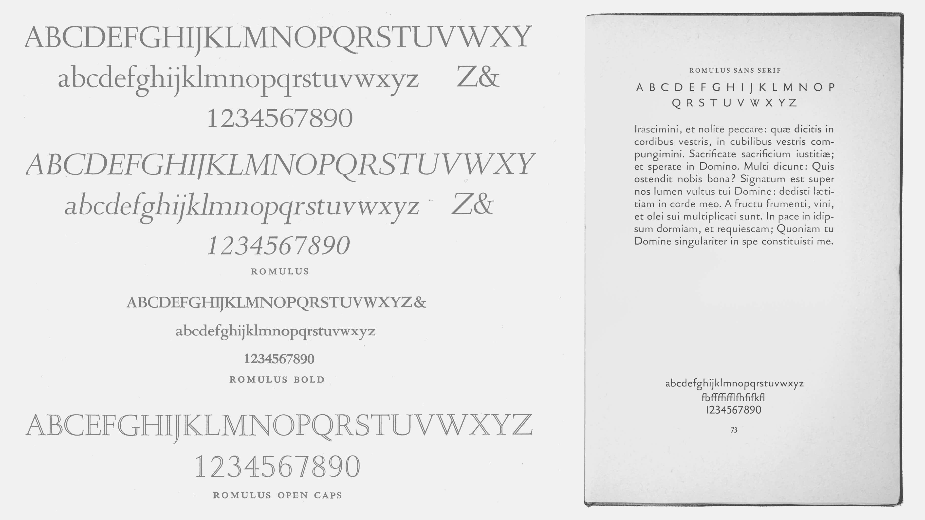
Contemplating serif/sans companions of the past, Jan van Krimpen’s Romulus of 1931, was presumably the first to be conceived as both serif and sans. ❶ Gerard Unger’s Demos and Praxis, Otl Aicher’s Rotis, Kris Holmes & Charles Bigelow’s Lucida series, Sumner Stone’s Stone series or Martin Majoor’s Scala and Scala Sans are more examples that spring to mind. Apparently, Matthew Carter specifically created Georgia and Verdana to work together as a matching sans and serif pair optimised for computer screens, but I wouldn’t consider them aesthetically related. Elias’ ABC Arizona, the first sans-to-serif variable font, is a logical progression along this conceptional lineage and each of the five static styles serve as singular, standalone typefaces.
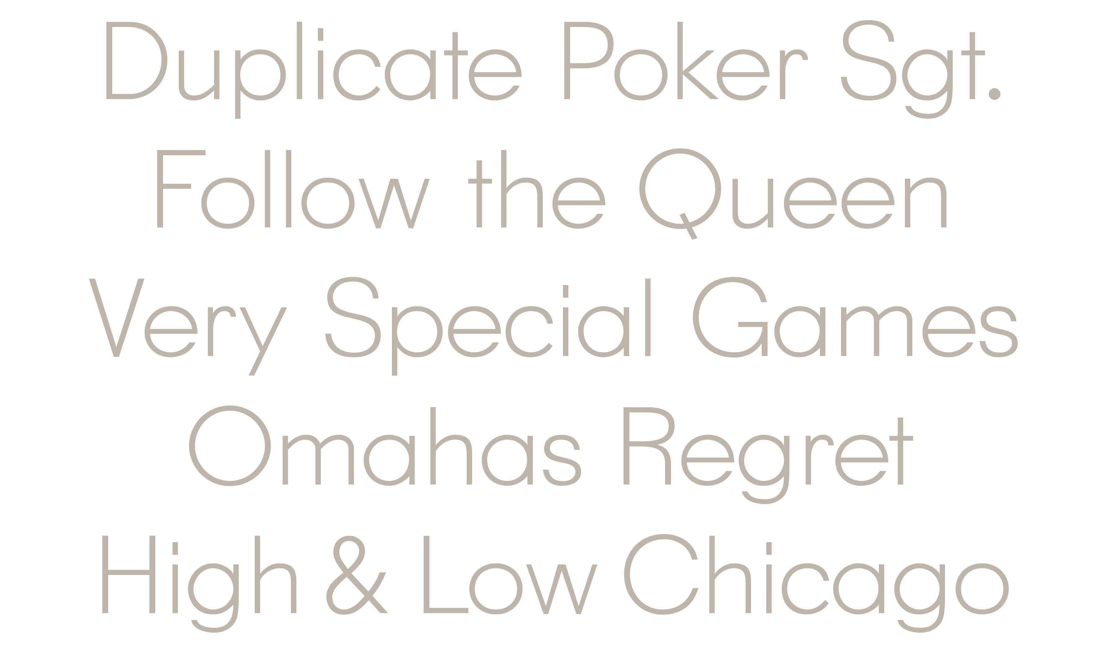
Be aware, Casino Sans is not simply Casino Serif with the serifs cut off. More work went into fine-tuning it to its current form. However, removing serifs may lead to intriguing results, such as James Goggin’s Courier Sans or Wei Huang’s serif-less “bootleg” version of Times New Roman. My own experiments with a slab-less sans version of Memphis, ❷ which I named Memphisn’t, lead me to believe that perhaps the first ever sans typeface was also created from a slab serif. Or vice versa? Both faces, the first sans ❸ and the first slab serif, ❹ were monolinear/low contrast and allegedly born in London around 1815 during Britain’s industrial revolution, published by the competing type-founders William Caslon IV and Vincent Figgins respectively. Just a coincidence you say… but which came first? The sans serif or the slab serif? Place your bets. More interesting than the chicken or egg debate, I think it’s mind-boggling to imagine this unprecedented, mad era of type design innovation, adapting to the needs of the exploding print and advertising industries and catering to hastily expanding companies, magnates and entrepreneurs.
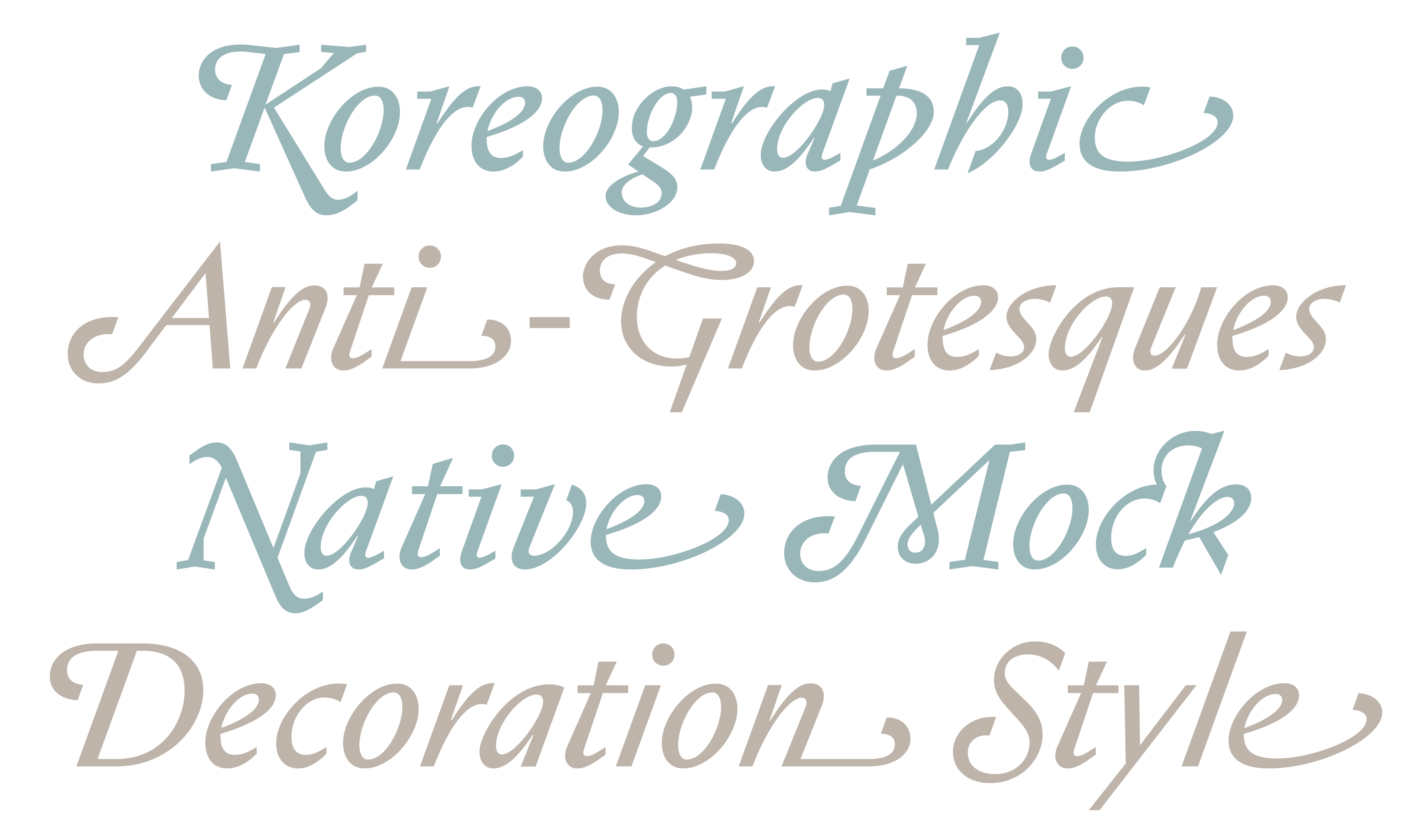
Back to Casino: the third subfamily, which evolved after Serif and Sans, was the seriffed Mono. Fitting the font’s name, the italics include many swashy, ornamental alternates to add a lure of extravagance, decor and bling. The swash caps are inspired by Vivaldi, Friedrich Peter’s 1966 award-winning design. We also added a number of initial and terminal swashes on lowercase letters as well as several standard and decorative ligatures. The Sans Italic contains all of the same swashes as Serif Italic, which is rather unique. Furthermore, all styles feature alternate diamond punctuation and are fully decked in our standard character set, ❺ covering more than 330 languages, including Vietnamese. You game?
Feeling lucky,
Lucas from HAL Typefaces
- Romulus Sans was designed by Jan van Krimpen as a sans serif companion to Romulus (Enschedé, 1931) in four weights, but never released.
- Memphis was designed by Dr. Rudolf Wolf and released by the Stempel foundry in 1929. It was one of the first typefaces to emerge from the revival of Egyptian or slab serif styles. In creating it, Wolf drew upon the geometric proportions found in the contemporary typefaces of Paul Renner and Jakob Erbar. A wave of new slab-serif printing types followed in the 1930s, including Beton, Stymie, Rockwell, and Karnak.
- The all-caps Two Lines English Egyptian, produced ca. 1816 by William Caslon IV. is widely regarded as the first commercial sans serif printing type.
- Vincent Figgins’ Antique, first shown in a specimen dated 1817, is widely considered to be the first commercially available slab serif.
- Inspired by Christoph Koeberlin’s Latin-S charset…